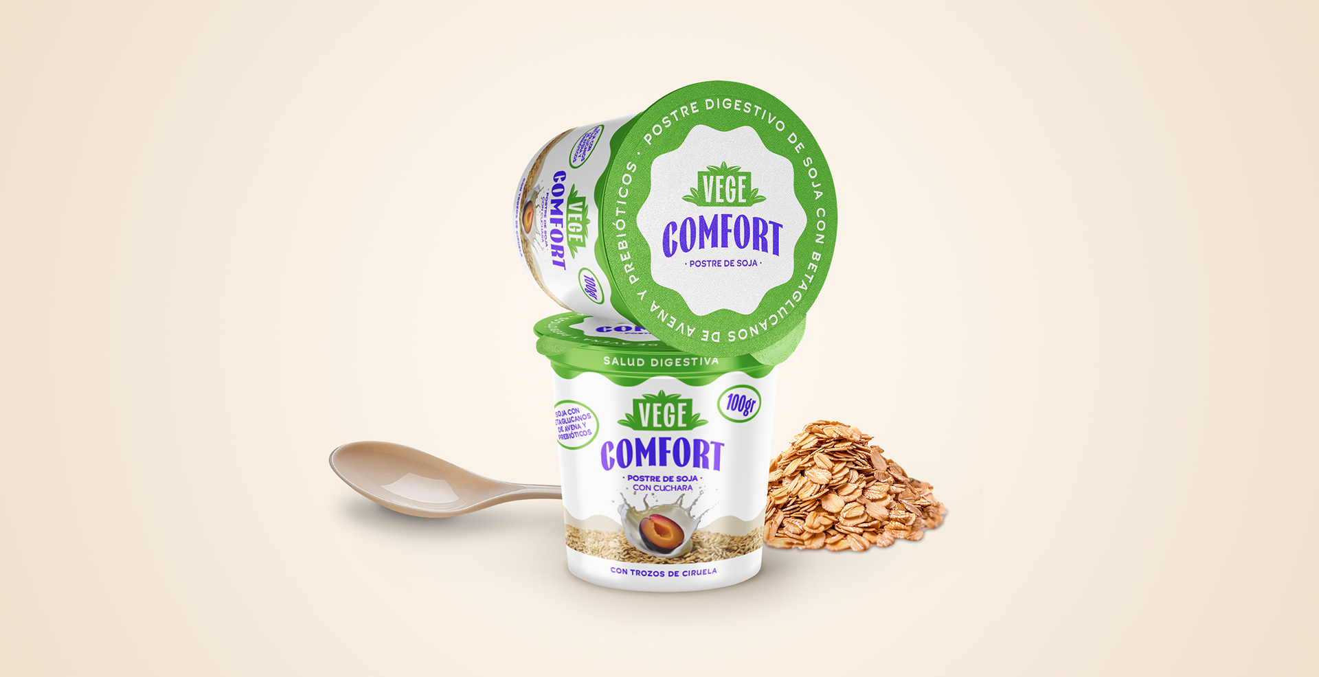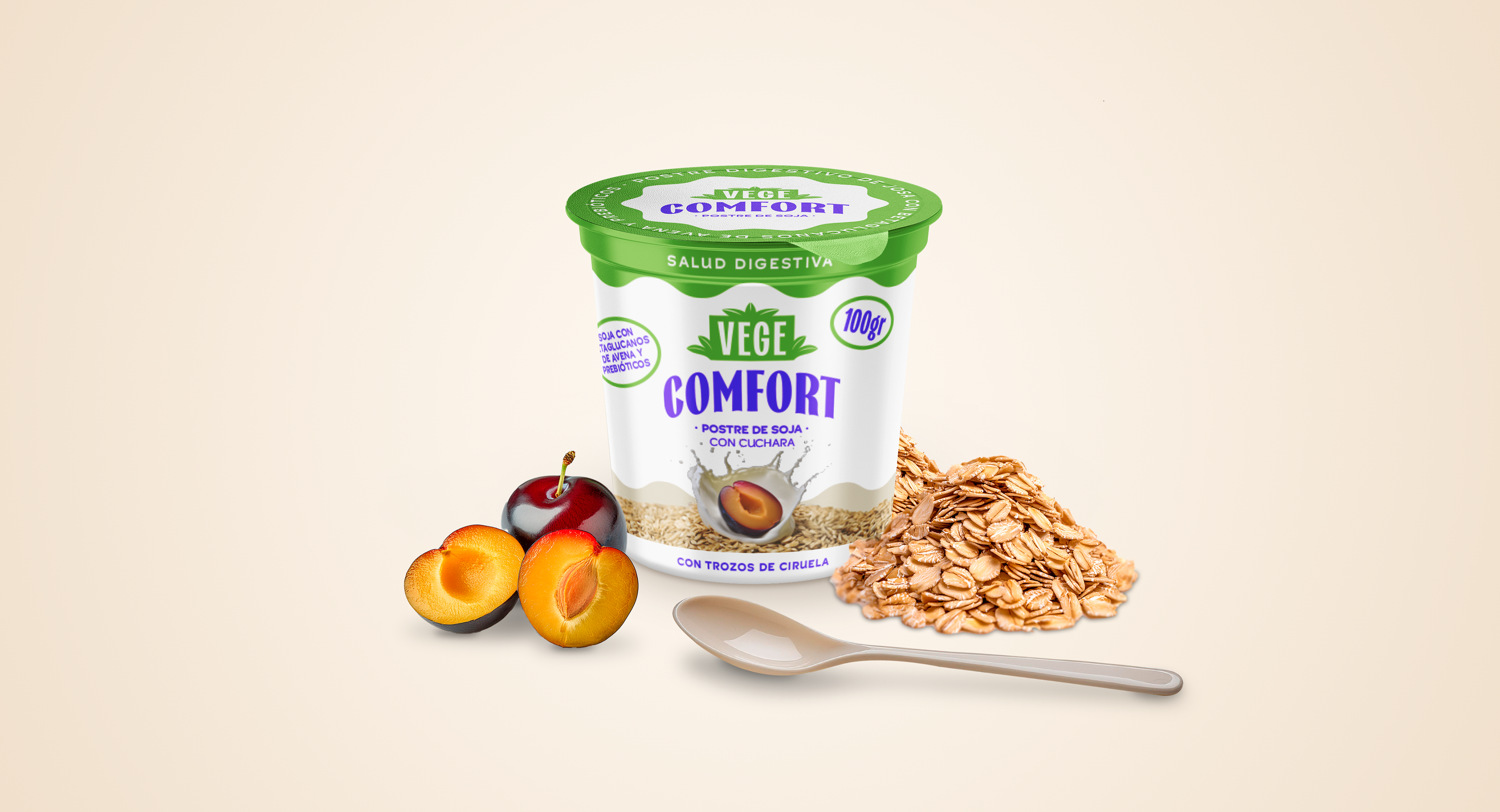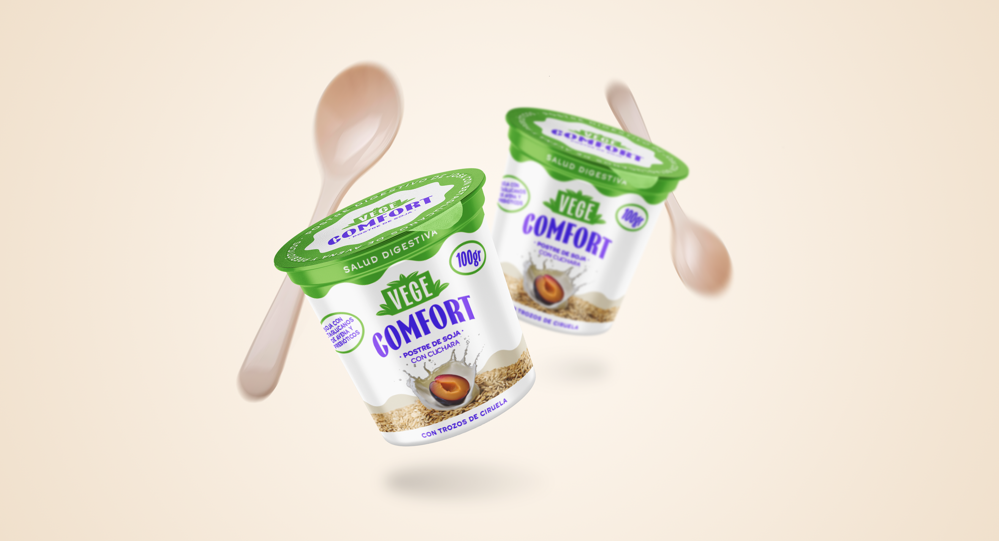
The project involves the development of packaging design for VEGE-COMFORT, a soy-based dessert/snack in a 100 g cup format, enriched with oat beta-glucans, prebiotics, and prune pieces—ingredients selected for their digestive health benefits. The main objective is to create packaging that clearly communicates these functional properties while emotionally connecting with an adult target audience aged 35 to 50, who values well-being, mindful eating, and the enjoyment of healthy options.
The visual concept should convey trust, naturalness, and modernity, positioning VEGE-COMFORT Cuchara as a balanced choice between health and taste. The design is expected to reflect both the nutritional quality and the pleasurable character of the product.
The defined deliverables for this project include the development of the logotype, the graphic design of the facing (front of the package), the lid design, and the creation of mockups that realistically showcase the final product in its consumption or commercial display context.
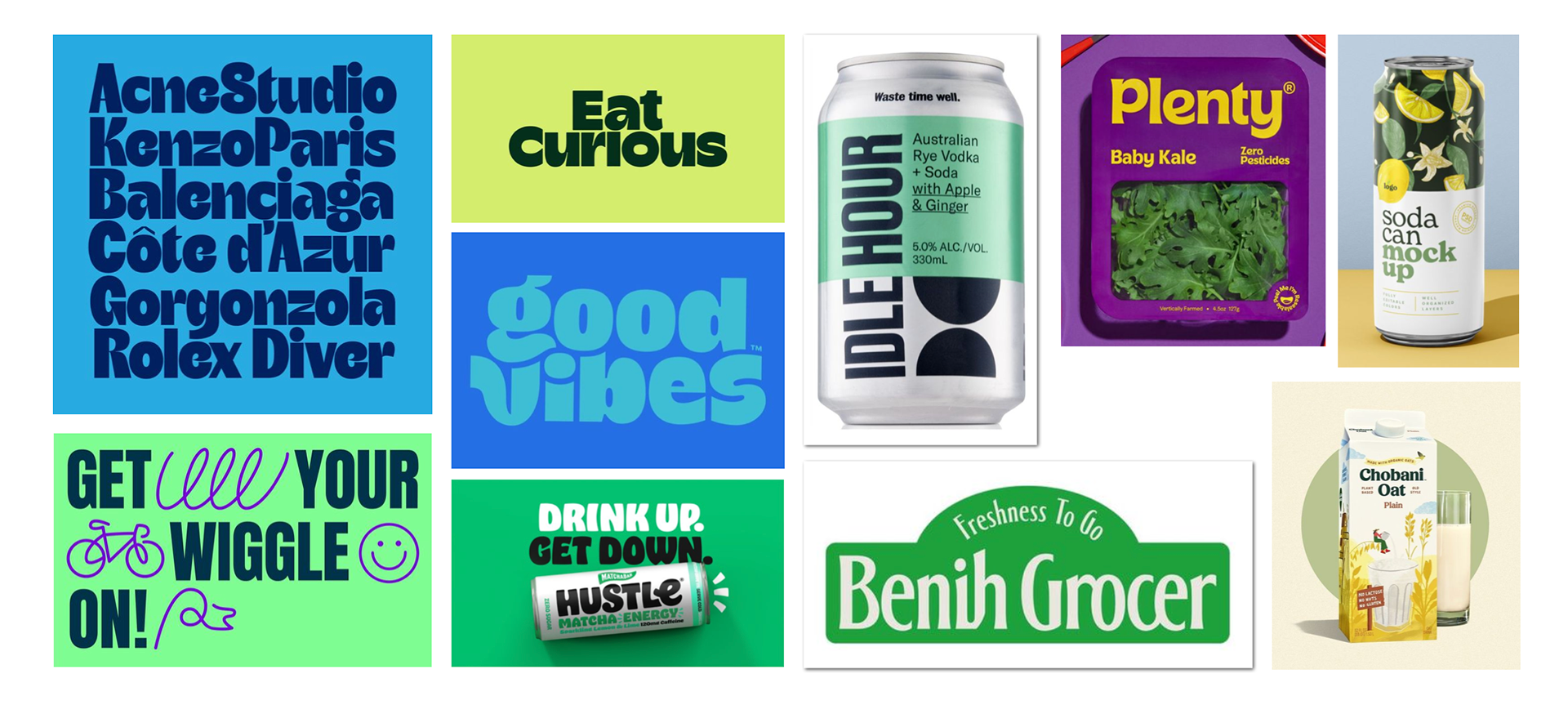
Moodboard and market research
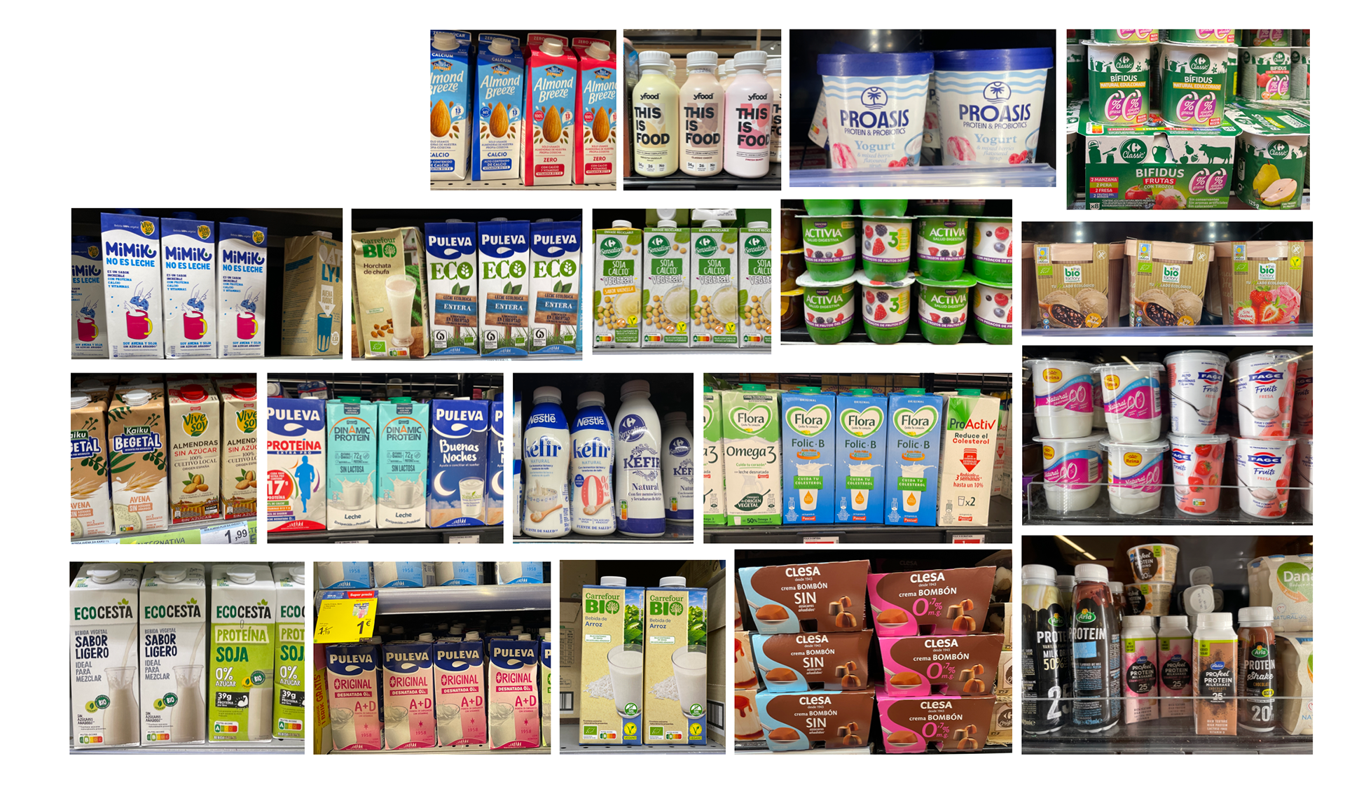
As part of the preliminary phase for the VEGE-COMFORT Cuchara design project, a market research study was conducted focusing on similar, comparable, and related products available in the most common supermarket chains across Spain. This analysis helped identify key trends within the functional food segment, particularly those targeting digestive health, and provided insights into packaging formats, visual communication strategies, and graphic language commonly used in the category. In parallel, a visual research phase was carried out to determine which graphic styles and aesthetics best reflect the product’s values and align with the expectations of the target audience, prioritizing a look and feel that conveys naturalness, well-being, and trust, while maintaining a contemporary and appealing design.
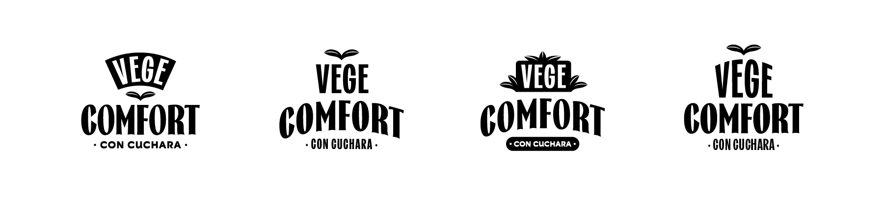
Logotype proposal
The final design of VEGE-COMFORT Cuchara successfully embodies the entire process of research, analysis, and conceptual development. The visual identity clearly communicates the product’s digestive health benefits, using graphic and color elements that evoke naturalness, wellness, and trust. The green palette reinforces the idea of health and nature, while the clean, modern typography and visual elements such as plums and oats emphasize the product’s functional ingredients without compromising visual appeal. The cup format with an integrated spoon, along with the carefully crafted facing and lid design, offers a practical and visually balanced solution that aligns with the expectations of the target audience. This outcome is the result of a well-grounded strategy that translated market insights and visual research into a compelling, consumer-oriented graphic proposal.